Smart scheduling for a 30-year-old family landscaping system.
A 70-customer FileMaker system that has been running since the mid-90s.
The crews don't open new apps — they open the same one they've always
used. I wired Claude-era capabilities into it without throwing any of it
away.
Platform
FileMaker Pro 22 + FM Server + FileMaker Go
Built with
Claude (Anthropic) · Open-Meteo · RainViewer · Windy
Timeline
~3 weeks of evenings · May 2026
The text from the truck
"What's a green dot mean — it's pouring in Latrobe."
That text came from my dad. He runs the family lawn-care business. He
was sitting in his truck in Latrobe, Pennsylvania, mid-afternoon on a
Sunday, watching a thunderstorm roll through a job the system I'd
built said was a green-light mow. The forecast had said dry. The radar
said otherwise. He was right.
This is the case study of what I built before that text, what was
wrong with it, and what the rebuild taught me — about FileMaker, about
Claude, and about the difference between making something correct and
making something a crew will actually use.
The system that runs the business
GP Custom Services has been a FileMaker shop since 1995. I built the
first system as a teenager working in my dad's business. Thirty years
later it's still the same database, just continuously extended:
customers, schedules, materials, invoices, bid history, route timing,
equipment, employees, year-over-year cost summaries.
Crews use FileMaker Go on their iPhones. The office uses FileMaker Pro
on the desktop. Everything talks to a FileMaker Server. Nothing about
that stack is fashionable in 2026, and nothing about it needs to be.
It does the job, and the crew is fluent in it the way you're fluent in
a tool you've used every day for a decade.
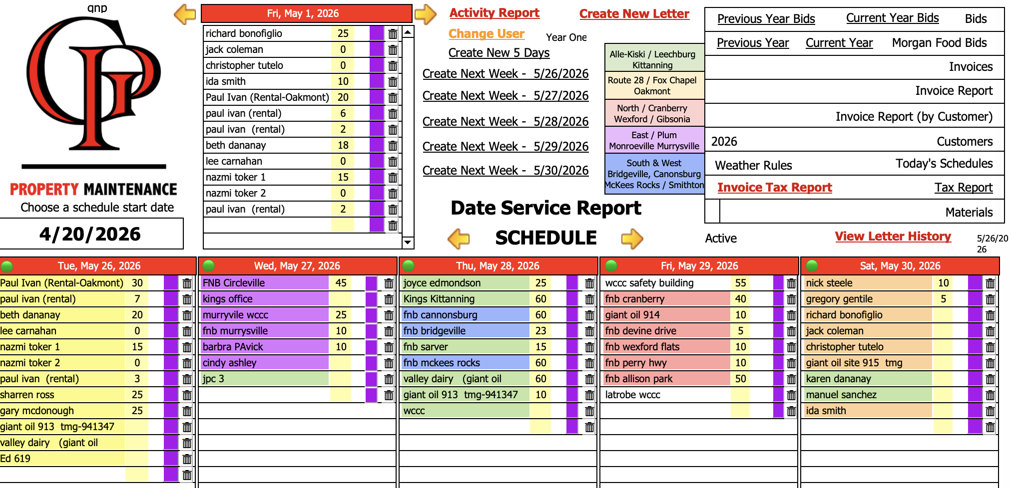
The main dashboard. Six-day schedule grid, color-coded by zone.
Customers, materials, invoices, bids — all one file, all one system.
The thing accumulated business logic. "Mowing cuts are scheduled
every N days based on customer-specific cycle length.""Chemical spray jobs need their own equipment reservation.""Zone priority is a number from 1 to 30 that determines route order."
That kind of knowledge isn't in a spec doc anywhere — it lives in the
Case statements and value lists and field defaults of a file that's
been carefully shaped for three decades.
That's the constraint and the asset at the same time. You don't get to
rebuild this; you get to extend it.
What I built, in three phases
Phase 1 — Geocode every customer
I added three fields to the Customers table — latitude,
longitude,
geocoded_at — and ran every active
customer's address through OpenStreetMap's Nominatim geocoder. Forty-five
landed exact (street-level), twenty-six fell back to a zip-centroid
approximation. All seventy-one geocoded. Two evenings of work,
including the address cleanup pass it forced.
Free, no API key, no vendor lock-in. The lat/lng on each customer
record then becomes the seam everything downstream snaps to.
Phase 2 — Pull the weather, once per day, for every location
A new WeatherCache table, a single server-side script
(Fetch Weather (Server)),
and Open-Meteo's free forecast API. The script finds every Schedule
Entry in the next seven days, deduplicates by location, fetches the
daily forecast for each, writes high/low/precipitation
probability/wind/weather-code into the cache. A 6-hour TTL prevents
re-fetching anything fresh.
FileMaker Server runs this on a schedule — every two hours during the
workday. No client involvement, no manual button. The crew opens the
app and the data is already there.
Phase 3 — Service-aware scheduling on the iPhone
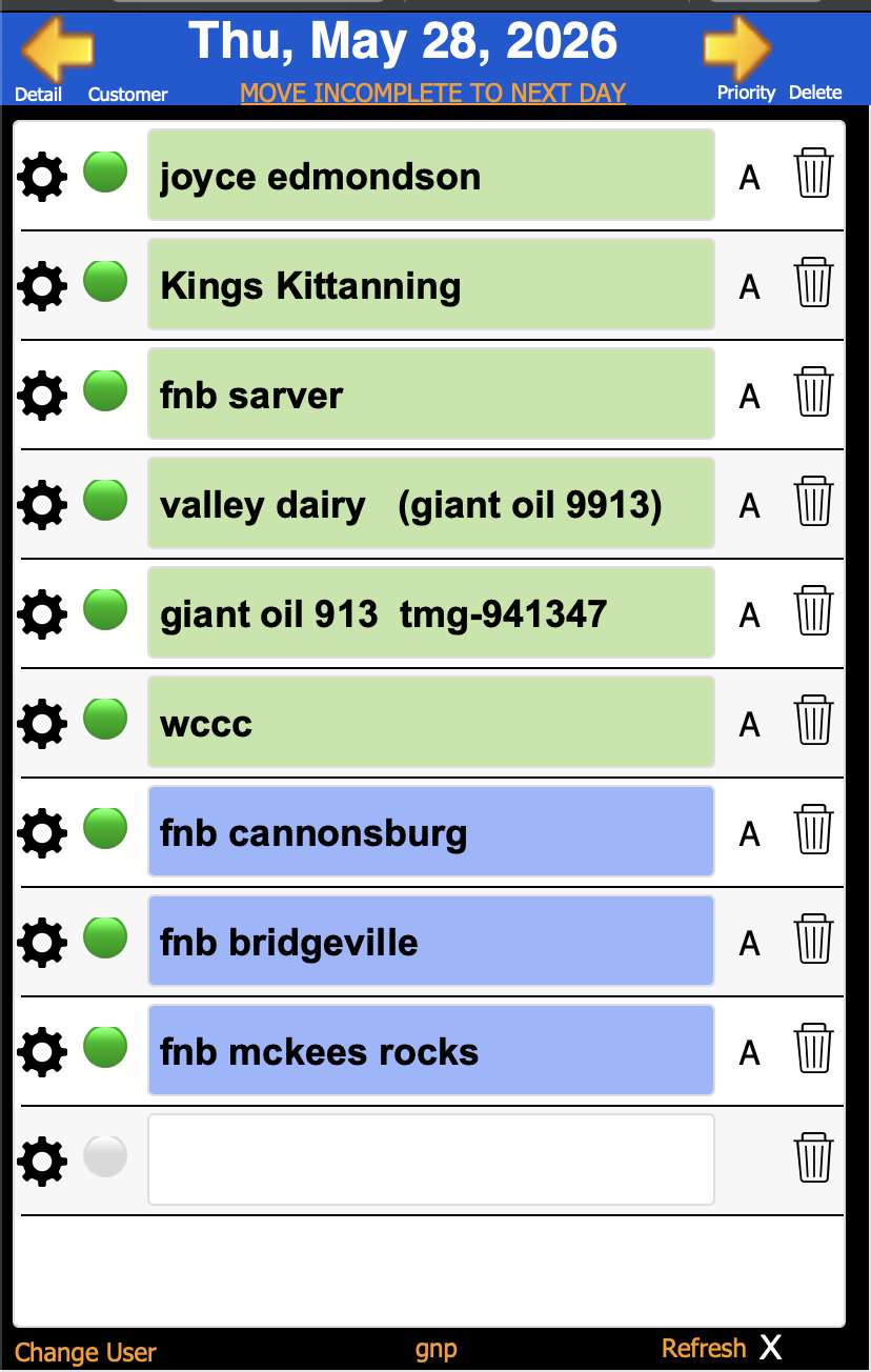
This is the part that landed in the crew's hands. A schedule list,
sorted by route, with a colored dot next to every job:
The daily schedule list on FileMaker Go. Same list the crew has had
for years — now with weather-aware coloring per zone.
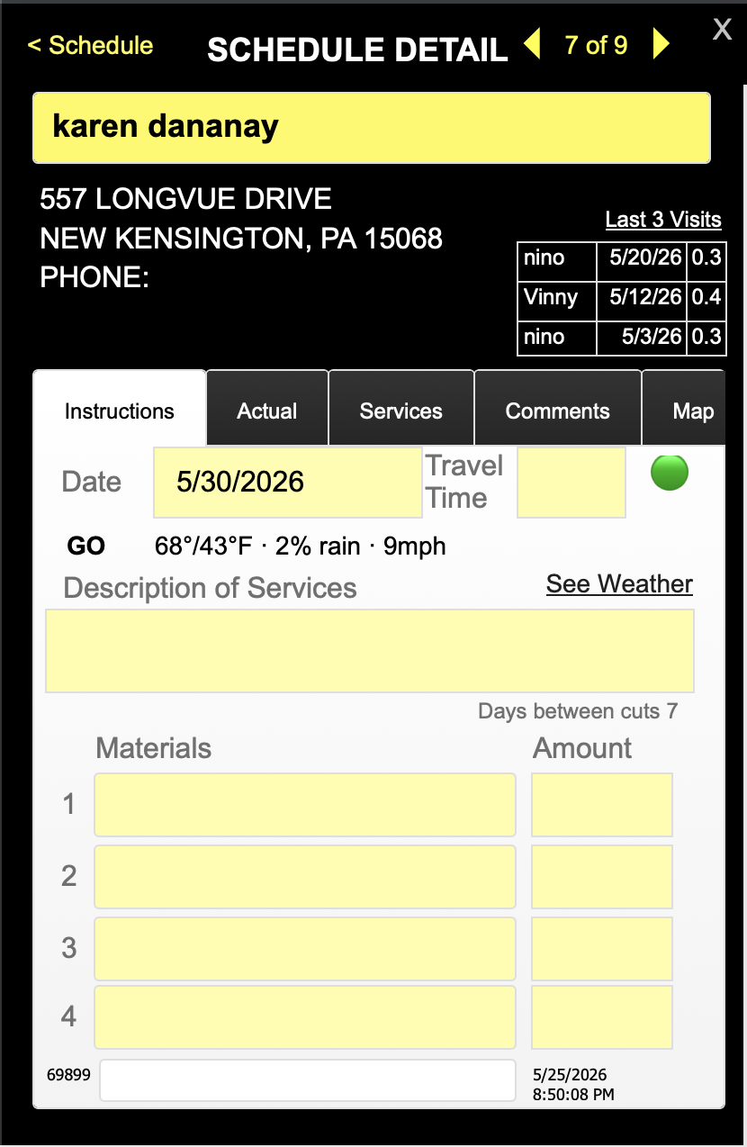
Tap any job and you land on its detail screen. The flag is inline at
the top — a green dot and the word GO, the conditions
in plain English, the description of work below:
GO · 68°/43°F · 2% rain · 9 mph. The flag is the planning hint,
right where the crew already looks.
Behind that little green dot is a service-aware rules engine. The
thresholds for "mow" are not the same as the thresholds for "spray."
Mowing needs dry; spraying needs low wind and a 50–85°F window;
fertilization actually wants light rain in the next 24 hours
to wash it in. The flag knows the difference because each Schedule
Entry has a service_type
calc field that classifies it from the indicator fields and
description text. The whole logic is a single calculation field on the
Schedule Entry table, evaluated unstored, recomputing the moment the
forecast or the rules change.
Then the storm hit.
Latrobe is about an hour east of Pittsburgh. On a Sunday afternoon in
May, the forecast was clear — 8% chance of rain for the day, no
accumulation expected. The flag said green. My dad drove out to mow.
Around 1:30 PM a pop-up thunderstorm developed and parked itself on
the town. He sheltered in his truck and waited it out. Then the text:
"What's a green dot mean — it's pouring in Latrobe."
I went and looked at what the system had done wrong. It had done
exactly what I'd asked it to. The fetch script pulled
daily aggregates — the maximum probability of rain
over the whole day. Open-Meteo's daily figure said 8%. The
rules engine asked "is 8% above the mowing-stop threshold of 70%?",
decided no, and rendered the dot green. The fact that the 8% was an
average across hours and that one specific hour at 1:30 PM had a
much higher probability was invisible to the calc, because the calc
was never given the hourly numbers.
It was a clean, correct failure. The system answered the question it
was asked. I had asked it the wrong question.
The rebuild — three changes that fixed it.
1. Pull hourly. Evaluate the workday window.
Adding one line to the Open-Meteo URL —
&hourly=precipitation_probability,precipitation,weather_code
— brought back twenty-four hourly values per location in the same
response payload. The fetch script wrote them into the existing
raw_json field with zero new
Set Field steps; the calc on the Schedule Entry now reads the worst
hour between 7 AM and 7 PM instead of the daily max. A 60% probability
at 1:30 PM is no longer hidden behind a daily 8% average.
2. Put words on the flag.
My dad didn't know what "green dot" meant in that moment. He'd been
shown the system, but he hadn't internalized the color convention.
Color alone is a code, and codes have to be taught. So I added a word
next to every dot — GO, MAYBE,
STOP — derived from the same flag value the dot uses.
Now the iPhone view reads "GO · 68°/43°F · 2% rain · 9 mph"
without any prerequisite knowledge.
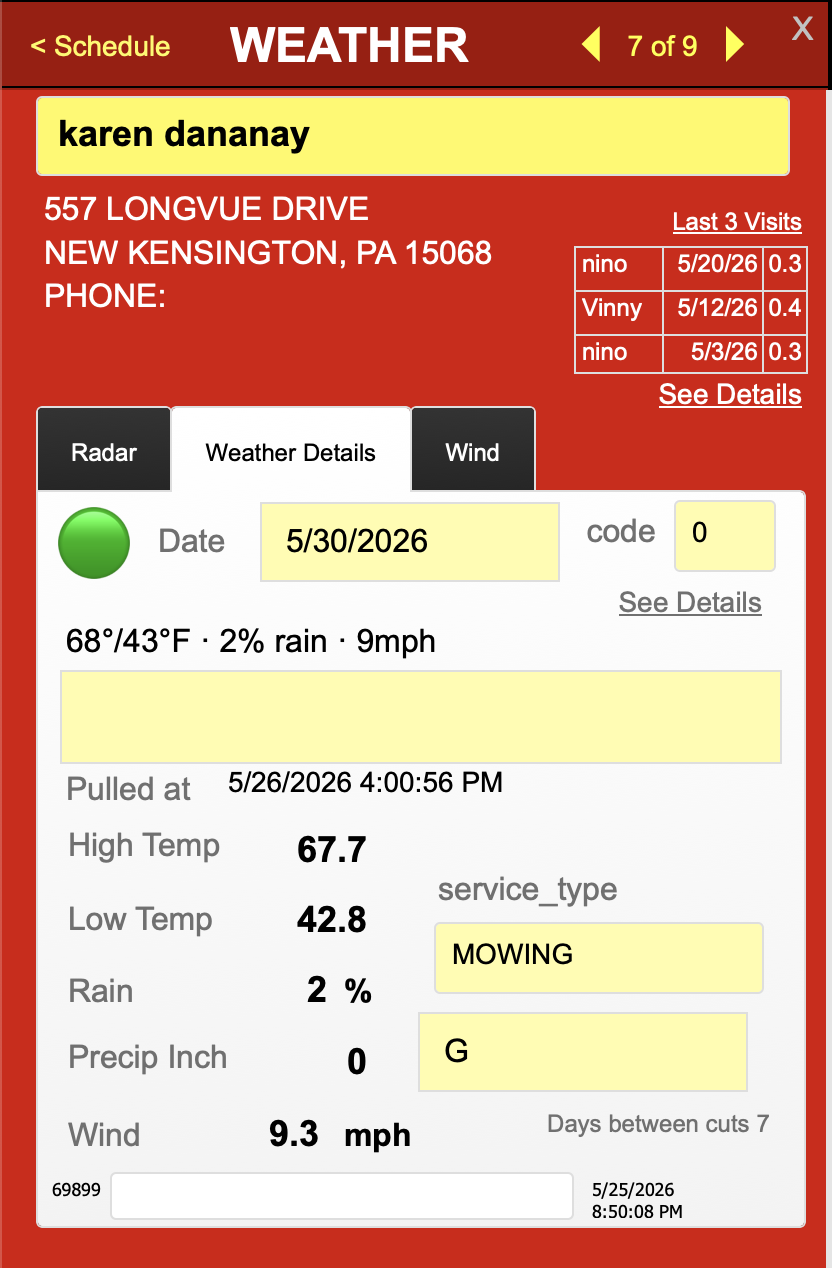
Weather Details tab — the planning view.
Schedule Detail — the planning hint right next to the work.
3. Make the live radar the default view.
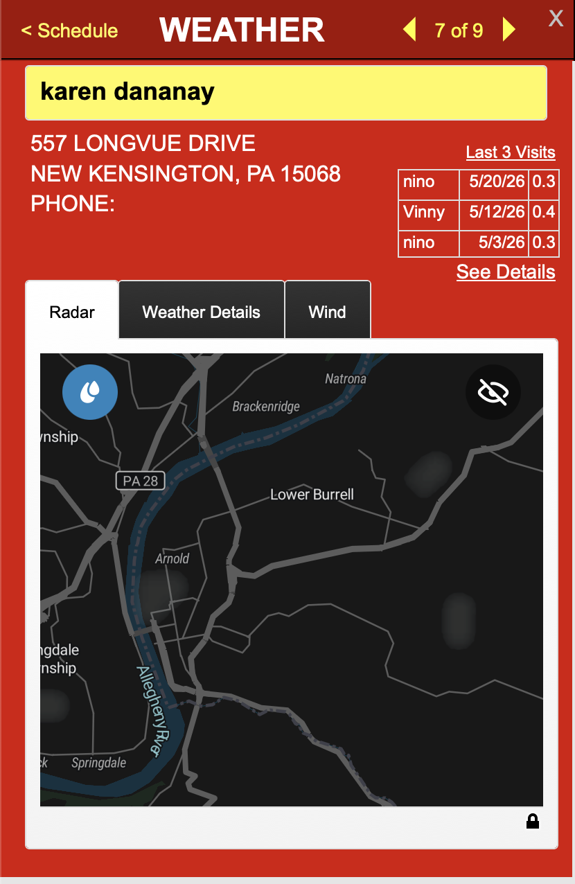
The forecast is a forecast. Sometimes the forecast is wrong. The crew
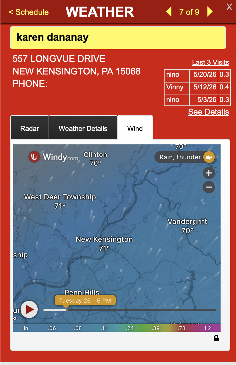
needs ground truth, not a probability. I added two web-viewer tabs to
the iPhone Weather panel — RainViewer for precipitation
radar, Windy for the broader regional picture — both
URL-templated against the customer's actual latitude and longitude so
the map centers on where the crew is going, not on some
default. And I made Radar the front tab. The flag is now the
planning hint; the radar is the source of truth.
RainViewer, centered on the customer.
Windy, for the regional picture.
Then I let my dad edit the rules.
The first version of the flag had thresholds hardcoded in the
calculation. "Mowing STOP at 70% rain probability." That's
fine for me — I wrote it — but my dad is the operator and his
intuition about what counts as too much rain to mow is more refined
than mine. He knows when wet grass damages a lawn versus when it
doesn't. He knows when the crew can work around drizzle and when it
actually shuts them down. None of that should live in my head.
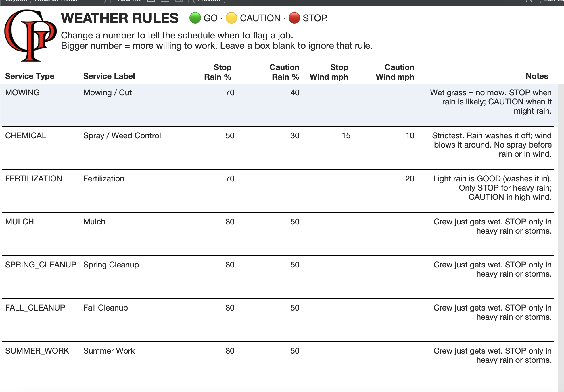
I built a WeatherRules table — one row per service
type, four editable numbers per row, plain-English labels and notes
columns. The flag calc reads from this table via a relationship.
Change a number, every job's flag recomputes. No script, no rebuild,
no developer call.
The Weather Rules layout. Plain words for the rule, plain numbers
for the thresholds, plain notes for the reasoning. Designed for the
operator, not the developer.
This is the pattern I keep coming back to. It's the difference
between "I built you a system that does X" and "I built you a system
that you can change without me." Every threshold becomes a row in a
table; every row gets a plain-English label and a note explaining the
reasoning. The calc reads from the table, falls back to safe defaults
if a row is missing, and never blanks the flag.
The harder problem: adoption.
When the first version called green on Latrobe and the storm hit
anyway, my dad's verdict was simple: "it doesn't work."
That was technically wrong — the system had answered the question
I'd asked it — but it was operationally right. A system whose
accuracy you can't audit in your head is a system you can't trust.
He didn't trust it. The fact that I could explain why it
had been wrong didn't help, because the explanation came from me,
the developer. He needed to be able to see for himself.
The rebuild's job wasn't only to be more correct — it was to be
correct in a way he could verify on his own. The hourly window
made the prediction match his lived experience of the workday. The
words on the flag took the convention out of the picture. The
radar as default meant he could always check the model against
reality before he rolled. The rules table meant he could see the
thresholds and turn the dials himself.
He's using it. His crews are using it. It rained the morning I
wrote this, the noon fetch ran on the server, and the flags
across every device in the field refreshed automatically without
anyone touching a button — exactly as designed. That's the part
of this story that almost didn't happen, and the part I'm
proudest of — not because the engineering was harder, but
because the engineering wasn't the point. Adoption is a
separate problem from correctness, and you have to solve it as
a separate problem.
What I'd do differently.
The thing that fell out of this project is a methodology — a way of
adding a Claude-assisted feature to an existing FileMaker system
without losing the trust of the people who use it.
It comes down to four things, each of which I got wrong the first
time and right the second:
01Right resolution. A daily average can hide an
afternoon storm. Pull hourly if you're making intra-day decisions.
Pull minutely if you're making the-next-twenty-minutes decisions.
Match the data resolution to the question being asked.
02Words next to codes. A green dot is a code. A
green dot labeled "GO" is a fact. The operator should never have
to remember a convention to read the output.
03Ground truth always one tap away. The model is
wrong sometimes. Surface the un-modeled view (radar, raw data,
primary source) right next to the modeled view, defaulted to the
ground truth. The flag is the hint; the radar is the truth.
04Editable in the operator's language. Every
threshold becomes a row in a table. Every row gets a plain
English label and a notes column explaining the reasoning. The
developer wrote the engine; the operator owns the dials.
That fourth one is the one I keep coming back to. Most FileMaker
consultants ship the thing and then become the bottleneck on every
tweak forever. The rules table makes the operator self-sufficient on
the part of the system that's most likely to need tuning. That's
worth more than a flashier UI by a mile.
More work
Ten years building a print shop operating system.
The Answer — estimating, job tickets, scheduling, shop floor data
collection, invoicing, inventory. One FileMaker system, six modules,
a live production floor.